6. Plotting Images
Download this page as a Jupyter notebook
This tutorial covers the built-in plotting functionality for images in Pylake. While most of the
examples shown use kymographs, the details described here are valid for
Kymo.plot(), Scan.plot()
and ImageStack.plot().
First, we load a data file:
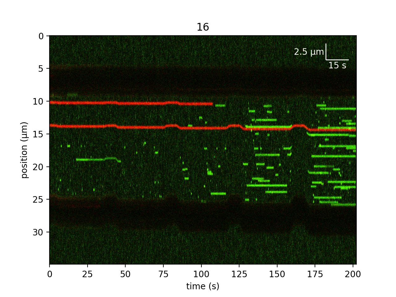
filenames = lk.download_from_doi("10.5281/zenodo.7729525", "test_data")
file = lk.File("test_data/kymo.h5")
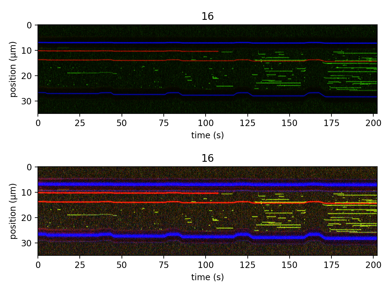
kymo = file.kymos["16"]
We can use the plot() function to plot individual
color channels and the full RGB image:
plt.figure(figsize=(6.4, 7))

# plot just the green channel
plt.subplot(3, 1, 1)
kymo.plot("green", adjustment=lk.ColorAdjustment(0, 15), aspect="auto")

#plot just the red and green channels
plt.subplot(3, 1, 2)
kymo.plot("rg", adjustment=lk.ColorAdjustment(0, 99, mode="percentile"), aspect="auto")
plt.title("just red & green")

# full color is default
plt.subplot(3, 1, 3)
kymo.plot(adjustment=lk.ColorAdjustment(0, 99, mode="percentile"), aspect="auto")
plt.title("full RGB")

plt.tight_layout()
plt.show()
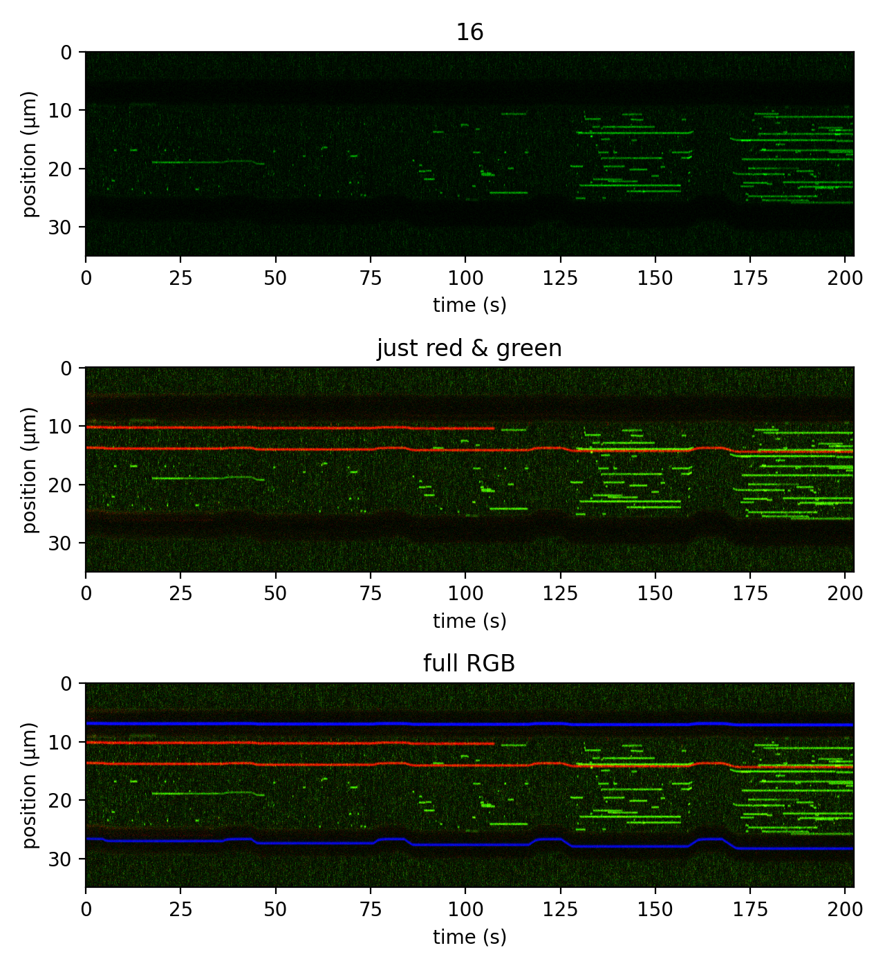
Note that the axes are labeled with the appropriate time and position units. For confocal scans, both axes are labeled with the appropiate spatial units. For camera-based images, this behavior is also true if the camera has been calibrated (with the corresponding metadata stored in the TIF file).
In addition, this method also accepts keyword arguments that are passed to
plt.imshow() internally. We see this with the aspect
argument above. The default aspect ratio Pylake uses for kymographs is such that pixels end up
visualized as square. However, for long kymographs like this one, the data is difficult to see
for such a narrow image; therefore we use aspect="auto" to just fill the available space in
the figure.
Note
This method accepts an additional keyword argument frame for both Scan
and ImageStack instances to specify the frame that is to be plotted.
6.1. Choosing color channels
The first argument channel accepts a string specifying the color channels to plot.
The default behavior is to plot all available color channels, which in most cases is an RGB image.
This is seen in the bottom panel of the figure above. This can also be specified using channel="rgb".
To plot just a single color channel (top panel of the figure above) use "red", "green", or
"blue" or their abbreviations "r", "g" or "b", respectively.
You can also plot a subset of channels (middle panel of the figure above) using combinations of
"r", "g", and/or "b". Note that these must be specified in RGB order (eg, to plot red and
green use "rg"; using "gr" will result in an error).
6.2. Adjusting color limits
We also see that the color limits can be set easily using the ColorAdjustment class.
This class takes two arguments representing the minimum and maximum desired color limits and an
optional mode keyword argument, which can be either "absolute" or "percentile".
If mode="absolute", the first two arguments act like the vmin and vmax arguments used with
plt.imshow(). This is the default behavior,
as demonstrated in the top panel of the figure above.
For multichannel images, it can be especially convenient to specify the limits from percentiles of the pixel values:
plt.figure()

plt.subplot(2, 1, 1)
kymo.plot("rgb", adjustment=lk.ColorAdjustment(0, 99.9, mode="percentile"))

plt.subplot(2, 1, 2)
kymo.plot("rgb", adjustment=lk.ColorAdjustment(0, [50, 99, 10], mode="percentile"))

plt.tight_layout()
plt.show()
The color scale is linear by default, but Gamma correction
can be applied in addition to the bounds by supplying an extra argument named gamma.
For example, a gamma adjustment of 0.1 to the red channel can be applied as follows:
plt.figure()

plt.subplot(2, 1, 1)
kymo.plot("rgb", adjustment=lk.ColorAdjustment(0, 99.9, mode="percentile"))
plt.title("default")

plt.subplot(2, 1, 2)
kymo.plot("rgb", adjustment=lk.ColorAdjustment(0, 99.9, gamma=[0.1, 1.0, 1.0], mode="percentile"))
plt.title("red gamma = 0.1")

plt.tight_layout()
plt.show()
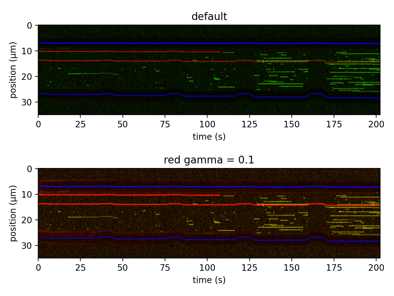
In the first plot, the limits are automatically calculated as the 0th and 99.9th percentile of all of the pixel values. In the bottom panel, we see that different values can be defined for each channel individually.
Note
When specifying values for each channel, a list of three values in RGB order must be supplied,
even if only one or two channels are plotted (ie, using channel="rg").
6.3. Scale bars
Similarly, you can easily add a scale bar to your plots simply by providing a
ScaleBar with the scalebar keyword argument:
plt.figure()

kymo.plot(
    "rg",
    scale_bar=lk.ScaleBar(15, 2.5),
    adjustment=lk.ColorAdjustment(0, 99, mode="percentile"),
    aspect="auto",
)
plt.show()
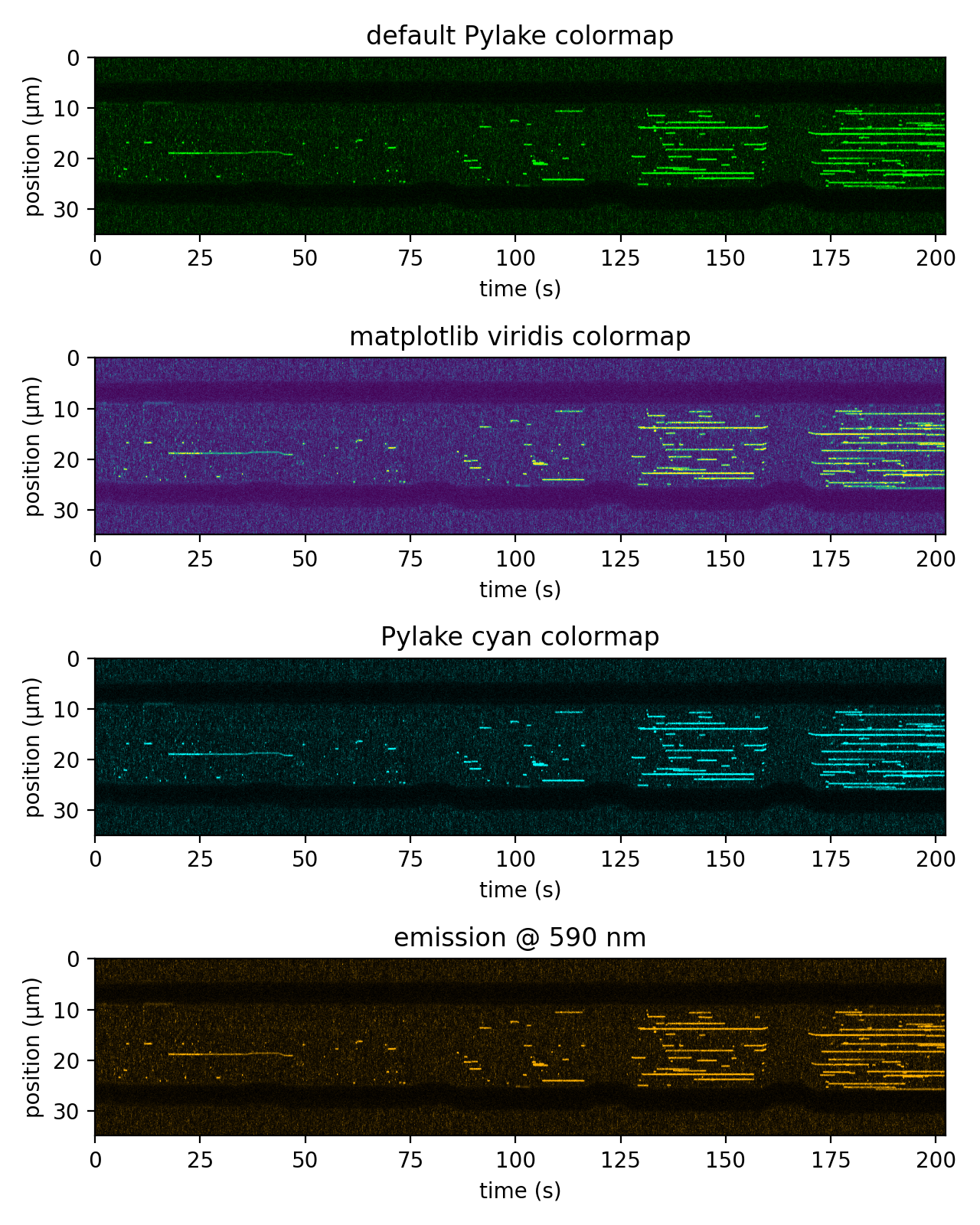
6.4. Pylake custom colormaps
We can use the standard cmap argument to control the visualization for single-channel images easily.
In addition to the colormaps provided by matplotlib, there are also a number of Pylake custom
colormaps for plotting single channel images. These are available from colormaps.
The available colormaps are: .red, .green, .blue, .magenta, .yellow, and .cyan, with the
first three being the default colormaps used by Pylake for plotting their respective channels.
We can also use the lk.colormaps.from_wavelength() method to generate a color map approximating
the color of a particular wavelength. This can be useful to visualize fluorophores closer to the
color of their actual emission wavelength.
These various options are demonstrated in the figure below:
kwargs = dict(adjustment=lk.ColorAdjustment(0, 99, mode="percentile"), aspect="auto")

plt.figure(figsize=(6.4, 8))

plt.subplot(4, 1, 1)
kymo.plot("g", **kwargs)
plt.title("default Pylake colormap")

plt.subplot(4, 1, 2)
kymo.plot("g", cmap="viridis", **kwargs)
plt.title("matplotlib viridis colormap")

plt.subplot(4, 1, 3)
kymo.plot("g", cmap=lk.colormaps.cyan, **kwargs)
plt.title("Pylake cyan colormap")

plt.subplot(4, 1, 4)
kymo.plot("g", cmap=lk.colormaps.from_wavelength(590), **kwargs)
plt.title("emission @ 590 nm")

plt.tight_layout()
plt.show()