5. Cas9 kymotracking
Download this page as a Jupyter notebook
5.1. Analyzing Cas9 binding to DNA
In this notebook we will analyze some measurements of Cas9 activity obtained while stretching the DNA tether at different forces.
Choosing an interactive backend allows us to interact with the plots. Note that depending on whether you are using
Jupyter notebook or Jupyter lab, you should be using a different interactive backend. For Jupyter lab that means also
installing ipympl as an extra dependency. Let’s begin by importing the
required Python modules and choosing an interactive backend for matplotlib:
import matplotlib.pyplot as plt
import numpy as np

# Use widget if you're using Jupyter lab or notebook
%matplotlib widget

# Use notebook if you're in nbclassic
# %matplotlib notebook
5.2. Download the kymograph data
The kymograph data is stored on Zenodo, a general-purpose open-access repository developed under the European OpenAIRE program and operated by CERN.
Zenodo allows researchers to deposit data sets, research software, reports, and any other research related digital artifacts and allows them to be referenced by a Digital Object Identifier (DOI).
We can download the kymograph we need directly from Zenodo using the function download_from_doi().
Since we don’t want it in our working folder, we’ll put it in a folder called "test_data":
filenames = lk.download_from_doi("10.5281/zenodo.4247279", "test_data")
5.3. Plotting the kymograph
Let’s load our Bluelake data and have a look at what the kymograph looks like. We can easily grab the kymo by calling
popitem() on the list of kymos, which returns the first kymograph:
file = lk.File(filenames[0])
_, kymo = file.kymos.popitem()
In this experiment, force was measured alongside the kymograph. Let’s plot them together to get a feel for what the data looks like:
plt.figure(figsize=(7, 4))

# Plot the kymograph
ax1 = plt.subplot(2, 1, 1)

# We use aspect="auto" because otherwise the kymograph would be very long and thin
kymo.plot("green", adjustment=lk.ColorAdjustment(0, 4), aspect="auto")

# Plot the force
ax2 = plt.subplot(2, 1, 2, sharex = ax1)
plt.xlim(ax1.get_xlim())
file["Force LF"]["Force 1x"].plot()
plt.tight_layout()

plt.show()
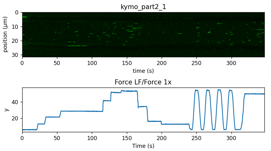
Note how color adjustment is specified for the kymograph. Any photon count outside the range provided to ColorAdjustment will be clipped to the nearest color.
What we can observe in this data is that as more force is applied, we get an increased binding activity. Let’s see if we can put the kymotracker to some good use and quantify these.
5.4. Computing the background
First, we select a small region without tracks to determine the background signal:
background = kymo["100s":"200s"].crop_by_distance(28, 31)
green_background_per_pixel = np.mean(background.get_image("green"))
5.5. Downsampling the kymograph
To make it a bit easier to tweak the algorithm parameters, we will make use of a notebook widget.
While we could work on the full time resolution data, we can make things a little easier for the kymotracking algorithm by downsampling the data a little bit.
We crop the beads out of the kymograph and downsample the data by a factor of 2:
kymo_ds = kymo.downsampled_by(2).crop_beads(4.89, algorithm="template")
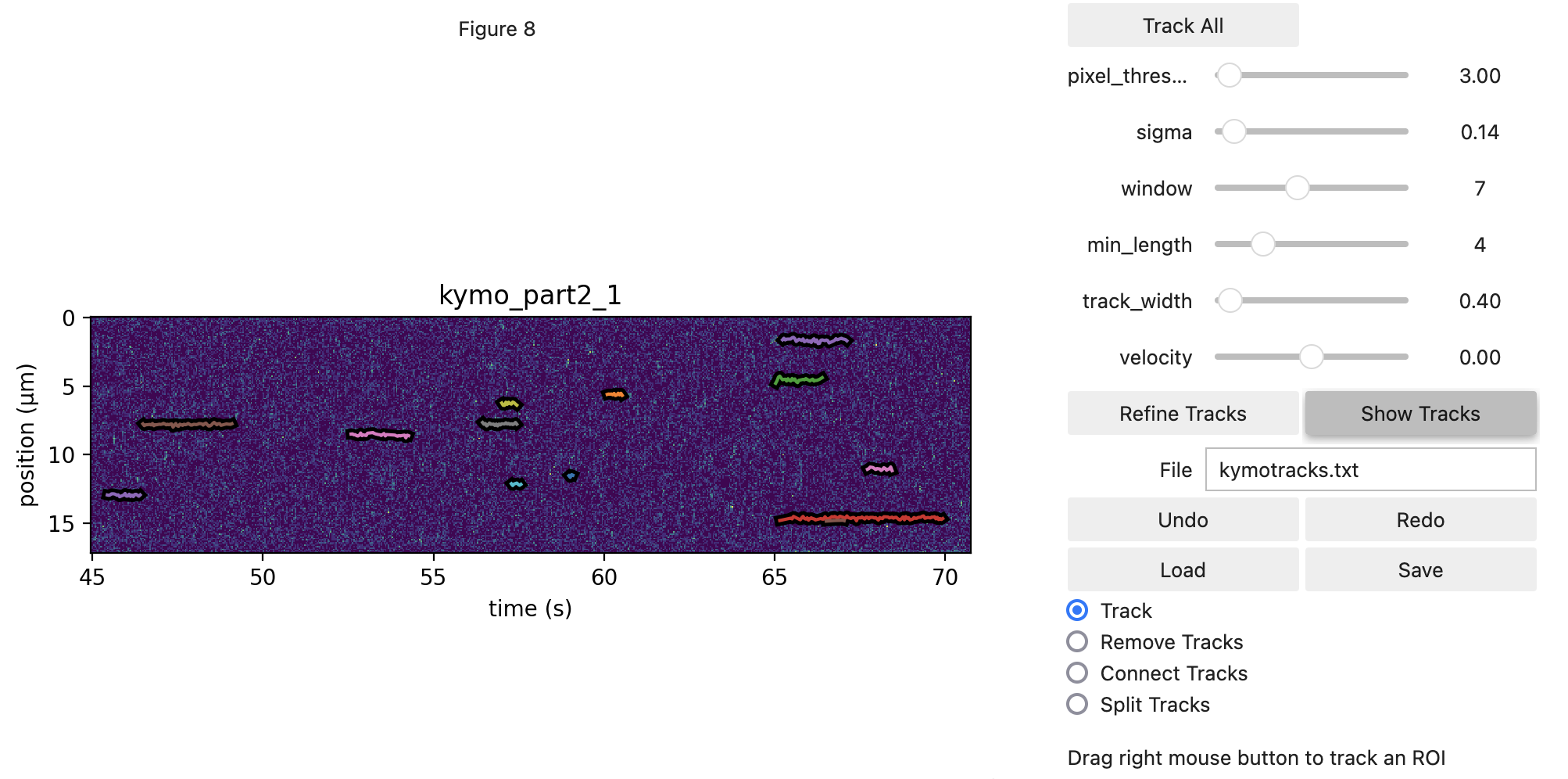
5.6. Performing the kymotracking
Now that we’ve loaded some data, we can begin tracking lines on it. For this, we open the widget.
This will provide us with a view of the kymograph and some dials to tune in algorithm settings. We open with a
custom axis_aspect_ratio which determines our field of view. This input is not necessary, but provides a better
view of our data.
We will be using the greedy algorithm. For more information on how it works, please refer to the Pylake kymotracking tutorial.
The threshold should typically be chosen somewhere between the expected
baseline photon count and the photon count of a true track (note that you can see the local photon count between square
brackets while hovering over the kymograph). The track width should roughly be set to the expected spot size (in the spatial dimension) of a
track. The window should be chosen such that small gaps in a track can be overcome, but not so large that spurious
points may be strung together as a track. Sigma controls how much the location can fluctuate from one time point to the
next, while the min length determines how many peak points should be in a track for it to be considered a valid track.
The optional adjacency_filter removes detections that have no detections in their neighboring frame (prior to tracking) which can cut down on noise.
Holding down the left mouse button and dragging pans the view, while the right mouse button allows us to drag a region where we should perform tracking. Any track which overlaps with the selected area will be removed before tracking new ones.
The icon with the little square can be used to toggle zoom mode, which will allow you to zoom in one subsection of the
kymograph. Clicking it again brings us back out of zoom mode. You can zoom out again by clicking the home button. Quite
often, it is beneficial to find some adequate settings for track all, and then fine-tune the results using the manual
rectangle selection. It’s not mandatory to use the same settings throughout the kymograph. For example, if you see a
particular event where two tracks are disconnected but should be connected, temporarily increase the window size and
just drag a rectangle over that particular track while having the option Track enabled.
Now, let’s do some tracking. There are two ways to approach this analysis. The first is to just use the rectangle
selection, which can be quite time intensive. Alternatively, you can use Track All to simply track the entire kymograph,
and then remove spurious detections by hand. This can be good to get a feel for the parameters as
well. If we select the Remove Tracks mode we will start removing tracks without grabbing new ones. This
functionality can be used to remove spurious detections.
Finally, if you wish to connect two tracks in the kymograph manually, you can switch to the Connect Tracks mode.
In this mode you can click a point in one track with the right mouse button and connect it to another by dragging to a point
in the track you wish to connect it to.
Note that in this data for example, there are some regions where fluorescence starts building up on the surface of the bead. This binding should be omitted from the analysis:
kymowidget = lk.KymoWidgetGreedy(
    kymo_ds,
    "green",
    axis_aspect_ratio=2.5,
    min_length=4,
    pixel_threshold=3,
    window=7,
    sigma=0.14,
    vmax=8,
    adjacency_filter=True,
    cmap="viridis",
    correct_origin=True
)
One last thing to note is that we assigned the KymoWidgetGreedy to the variable kymowidget. That means that from
this point on, we can interact with it through the handle name kymowidget.
Exporting from the widget results in a file that contains the track coordinates in pixels and real units.
If we also want to export the photon counts in a region around the track, we can include a sampling_width.
This sums the photon counts from pixel_position - sampling_width to (and including) pixel_position + sampling_width:
kymowidget.save_tracks("kymotracks_calibrated.txt", sampling_width=3)
5.7. Analyzing the results
The tracks are available from the tracks property, which returns a KymoTrackGroup object.
This is a customized list of KymoTrack objects which in turn contain lists of position and time coordinates for each tracked particle.
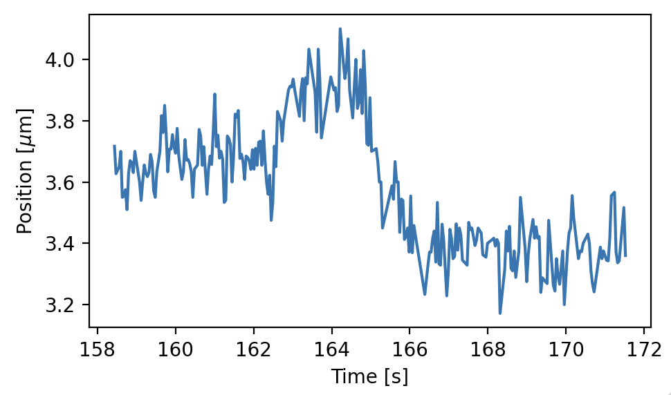
These coordinates can be accessed with the position and seconds properties, respectively. Let’s grab the longest track we found, and have a look at its position over time:
lengths = [len(track) for track in kymowidget.tracks]

# Get the index of the longest track
longest_index = np.argmax(lengths)

# Select the longest track
longest_track = kymowidget.tracks[longest_index]

plt.figure(figsize=(5, 3))
plt.plot(longest_track.seconds, longest_track.position)
plt.xlabel('Time [s]')
plt.ylabel(r'Position [$\mu$m]')
plt.tight_layout()
plt.show()
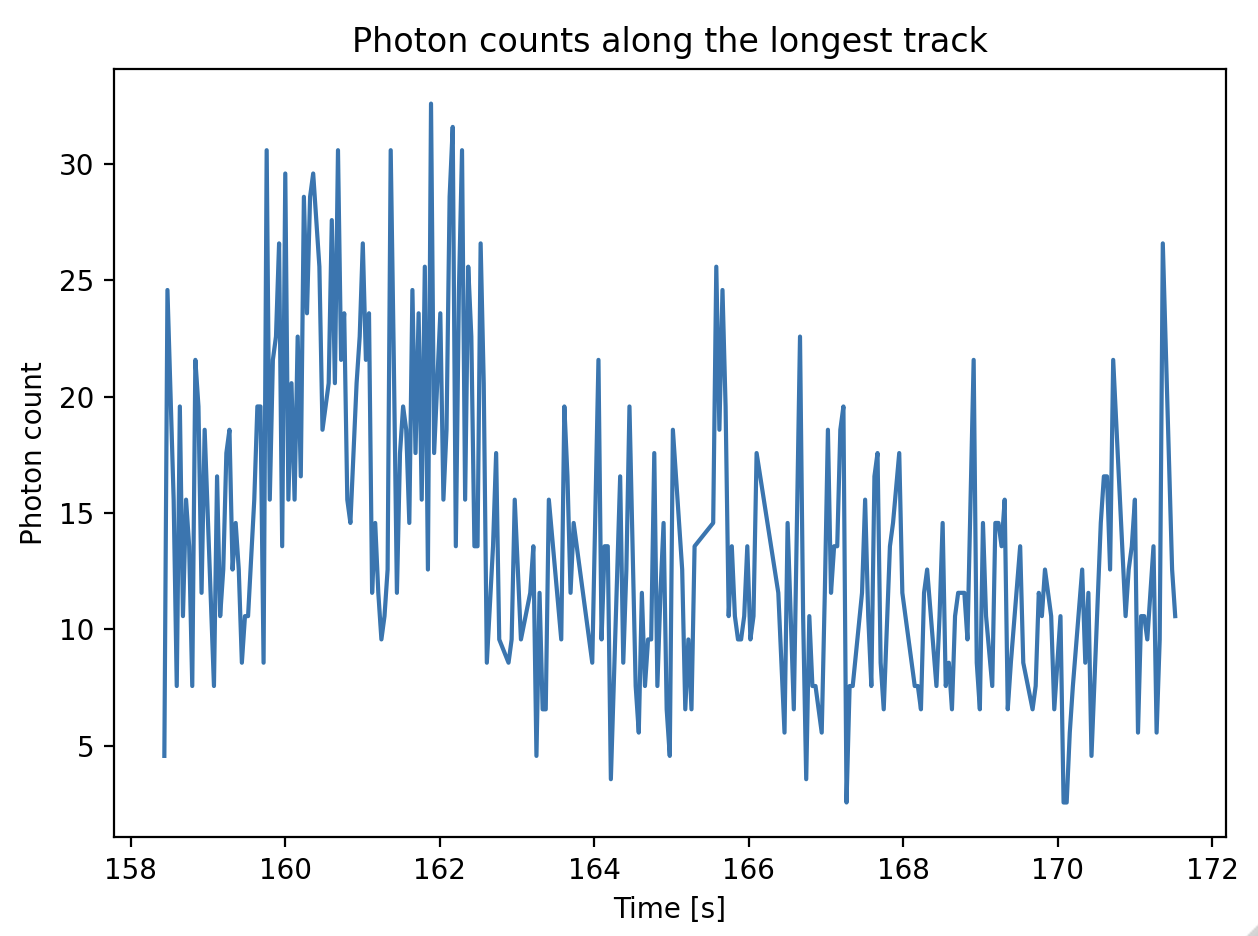
The track coordinates can be used to sample the photon counts in the image. The example below demonstrates how to obtain the sum of the photon counts in a pixel region around the track from -3 to 3 (a track with a width of 7 pixels). The background per pixel as computed earlier is subtracted from the photon counts. Since the kymograph was downsampled by a factor 2 after computing the background, the background per pixel is multiplied by 2:
window = 3
bg_corrected = longest_track.sample_from_image(window, correct_origin=True) - (2 * window + 1) * 2 * green_background_per_pixel

plt.figure()
plt.plot(longest_track.seconds, bg_corrected)
plt.ylabel('Photon count')
plt.xlabel('Time [s]')
plt.title('Photon counts along the longest track')
plt.tight_layout()
plt.show()
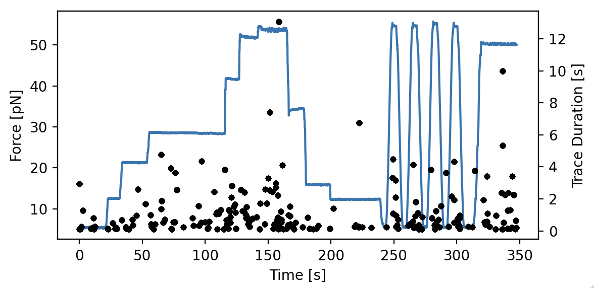
Since we are interested in how the binding events are affected by the applied force, let’s have a look how long the tracks are when we compare them to the force:
plt.figure(figsize=(6, 3))
ax1 = plt.subplot(1, 1, 1)
time = file["Force LF"]["Force 1x"].seconds
force = file["Force LF"]["Force 1x"].data
plt.plot(time, force)
plt.xlabel('Time [s]')
plt.ylabel('Force [pN]')

ax2 = ax1.twinx()
track_start_times = np.array([track.seconds[0] for track in kymowidget.tracks])
track_stop_times = np.array([track.seconds[-1] for track in kymowidget.tracks])
track_durations = track_stop_times - track_start_times
[plt.plot(track_start_times, track_durations, 'k.') for track in kymowidget.tracks]
plt.ylabel('Trace Duration [s]')
plt.xlabel('Start time [s]')
plt.tight_layout()
However, what we wanted to know was how the force affects initiation. To determine this, we will need to know the force
at which events were started. To do this, we compare the track_start_time we just computed to the time in the force
channel. What we want is the index with the smallest distance to our track start time. We can use numpy.argmin() for
this, which will return the index of the minimum value in a list. Once we have the index, we can quickly look up the
force for each track start position:
force_index = [np.argmin(np.abs(time - track_start_time)) for track_start_time in track_start_times]
track_forces = force[force_index]
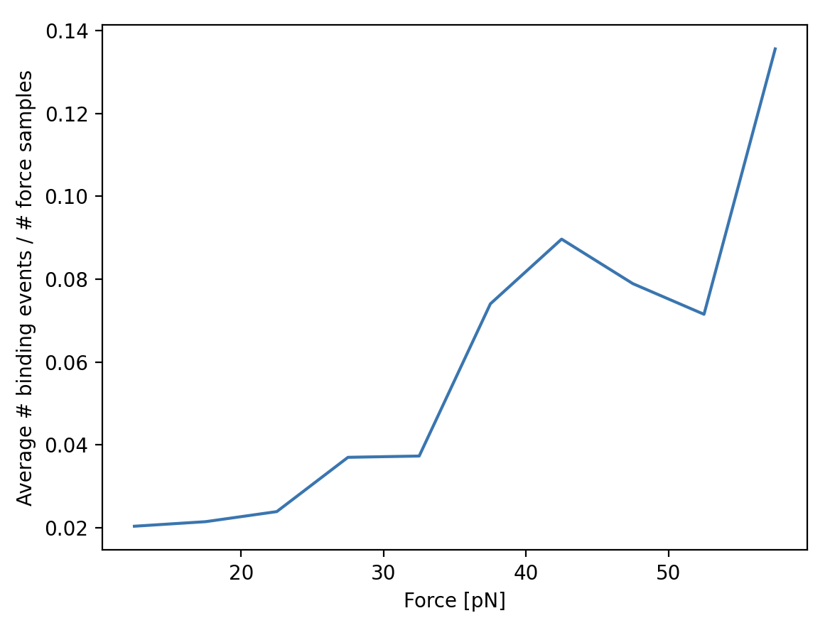
We can look at the number of events started at each force by making a histogram of these start events. Let’s make a
10 bin histogram for forces from 10 to 60:
events_started, edges = np.histogram(track_forces, 10, range=(10, 60))
Since we didn’t spend an equal amount of time in each force bin, we should normalize by the time spent in each force bin. We can also compute this with a histogram:
samples_spent_at_force, edges = np.histogram(force, 10, range=(10, 60))
And that gives us sufficient information to make the plot:
centers = 0.5 * (edges[:-1] + edges[1:])
plt.figure()
plt.plot(centers, events_started / samples_spent_at_force)
plt.xlabel('Force [pN]')
plt.ylabel('Average # binding events / # force samples')